
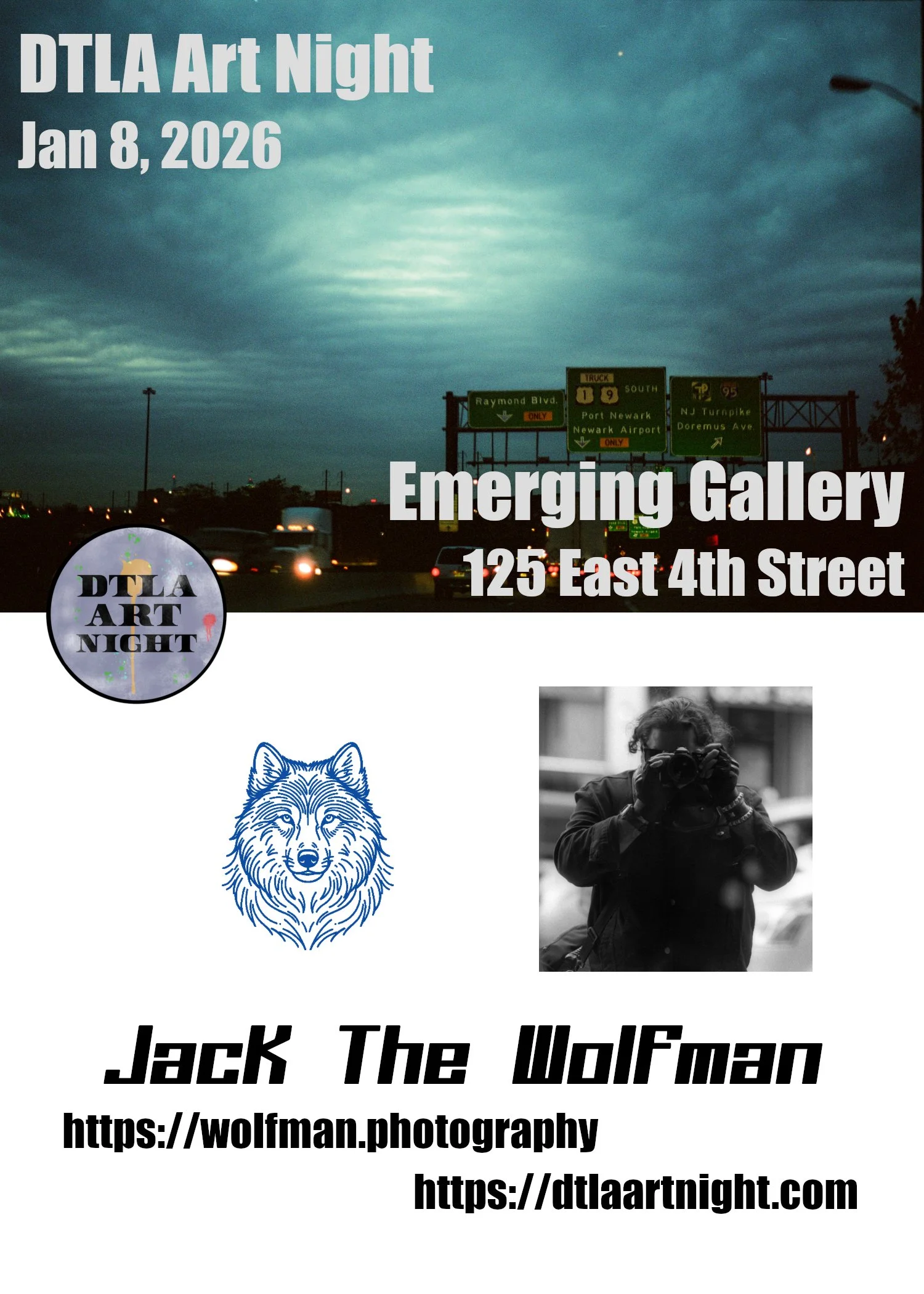
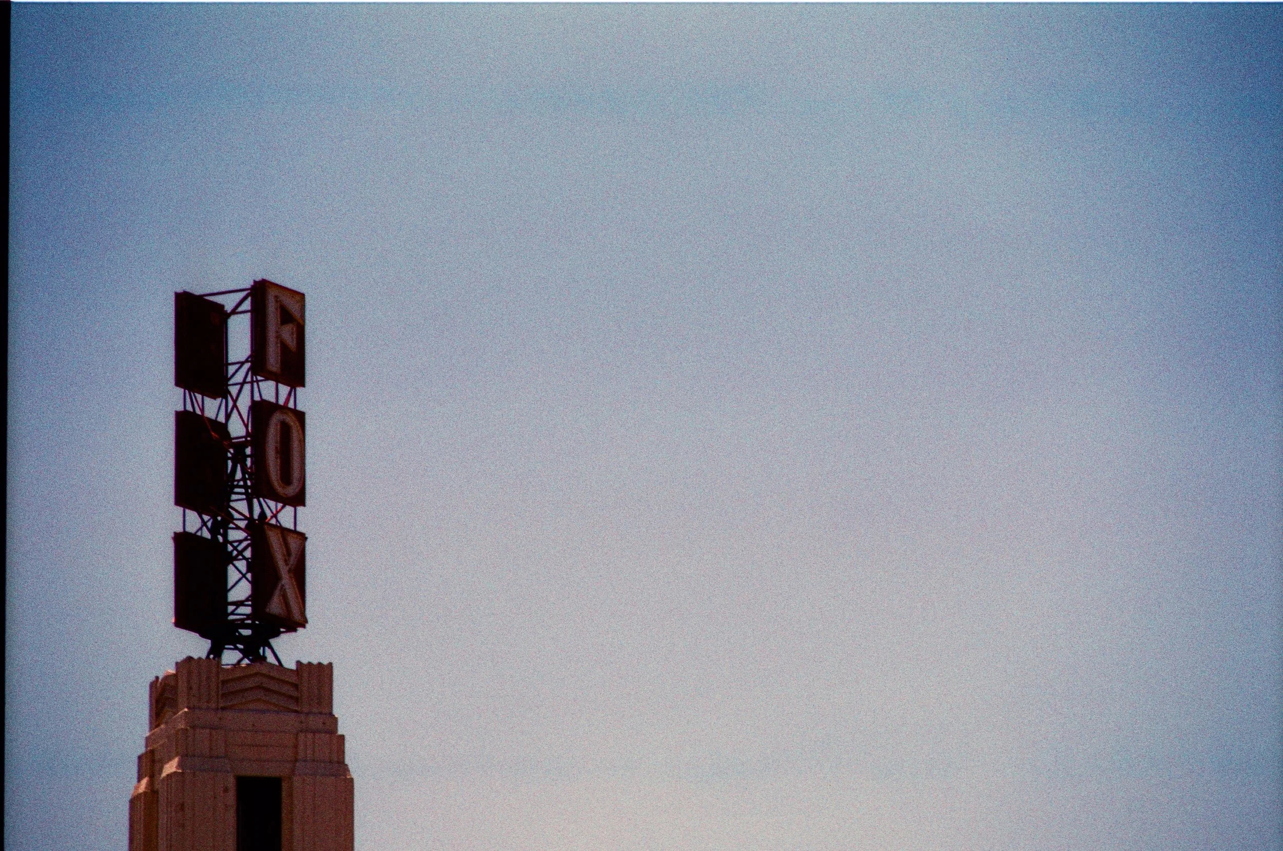
DTLA Artnight Jan 8th
I am returning at the Emerging Gallery on Jan 8th, hosting 5 new prints. These will be up all month January. Come by and check it out. While you are there, also get a map, and be sure to check out the 50 some-odd other vendors and exhibits in DTLA. Maps of events in Emerging Gallery
I am returning at the Emerging Gallery on Jan 8th, hosting 5 new prints. These will be up all month January. Come by and check it out. While you are there, also get a map, and be sure to check out the 50 some-odd other vendors and exhibits in DTLA. Maps of events in Emerging Gallery
When
January 8th, 2026
6PM -> 10 PM
Where
Emerging Gallery
125 East 4th Street
Los Angeles, 90013


Gallery Showing All Month
As you know, last Thursday was the opening at Emerging Gallery for Art Night. The photos will be up all month. You can stop in when this Gallery is open to see these in person.
These are 20”x30” printed as a set from LA Film lab using their relatively new 350 Gram Museum Etching process, resulting in absolute bright colors and vivid deep satin blacks, especially with the neon work.
All of these are framed 20”x30”, with a price of $350 each.
For sales, contact me directly, either through the contact me directly through “Contact” tab, or message me on Instagram in the “Links” section. I take cash, credit card, and Venmo.
Only the 20”x30” photograph are mine. The smaller photos and other media are other artists. Do not contact me about those works.
Full details in article
Emerging Gallery
125 East 4th St, Los Angeles, CA 90013
As you know, last Thursday was the opening at Emerging Gallery for Art Night. The photos will be up all month. You can stop in when this Gallery is open to see these in person.
These are 20”x30” printed as a set from LA Film lab using their relatively new 350 Gram Museum Etching process, resulting in absolute bright colors and vivid deep satin blacks, especially with the neon work.
All of these are framed 20”x30”, with a price of $350 each.
For sales, contact me directly, either through the contact me directly through “Contact” tab, or message me on Instagram in the “Links” section. I take cash, credit card, and Venmo.
Only the 20”x30” photograph are mine. The smaller photos and other media are other artists. Do not contact me about those works.
Work Featured by Prints
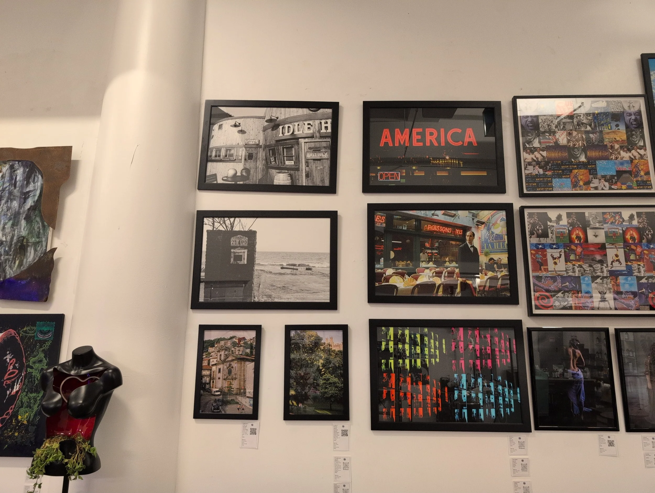
Emerging Gallery, DTLA
Works Featured By Name
From left to right, top to bottom
The Idle Hour - Shot on beautiful Kodak TriX 400, this piece is a favorite. The old-timeyness of the TriX adds authentic old fashion, being in production since 1946. The grain of the film really brings out the wood grain of the exterior. The tight crop gives a larger than life imposing feeling that the building is large barrels contrasted with an actual normal size barrel in the front
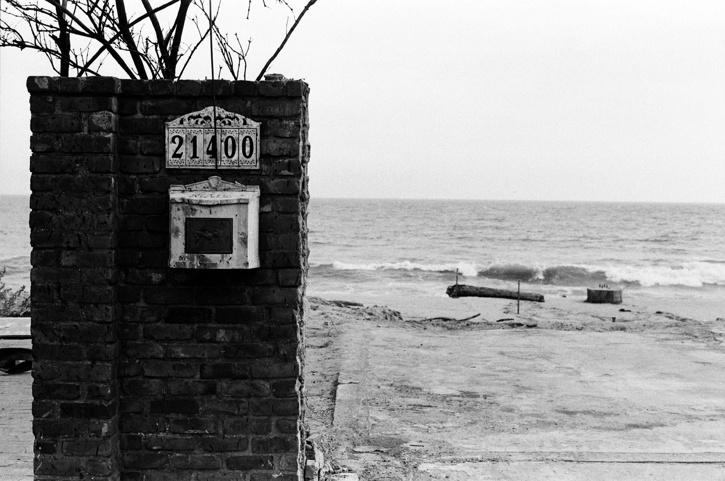
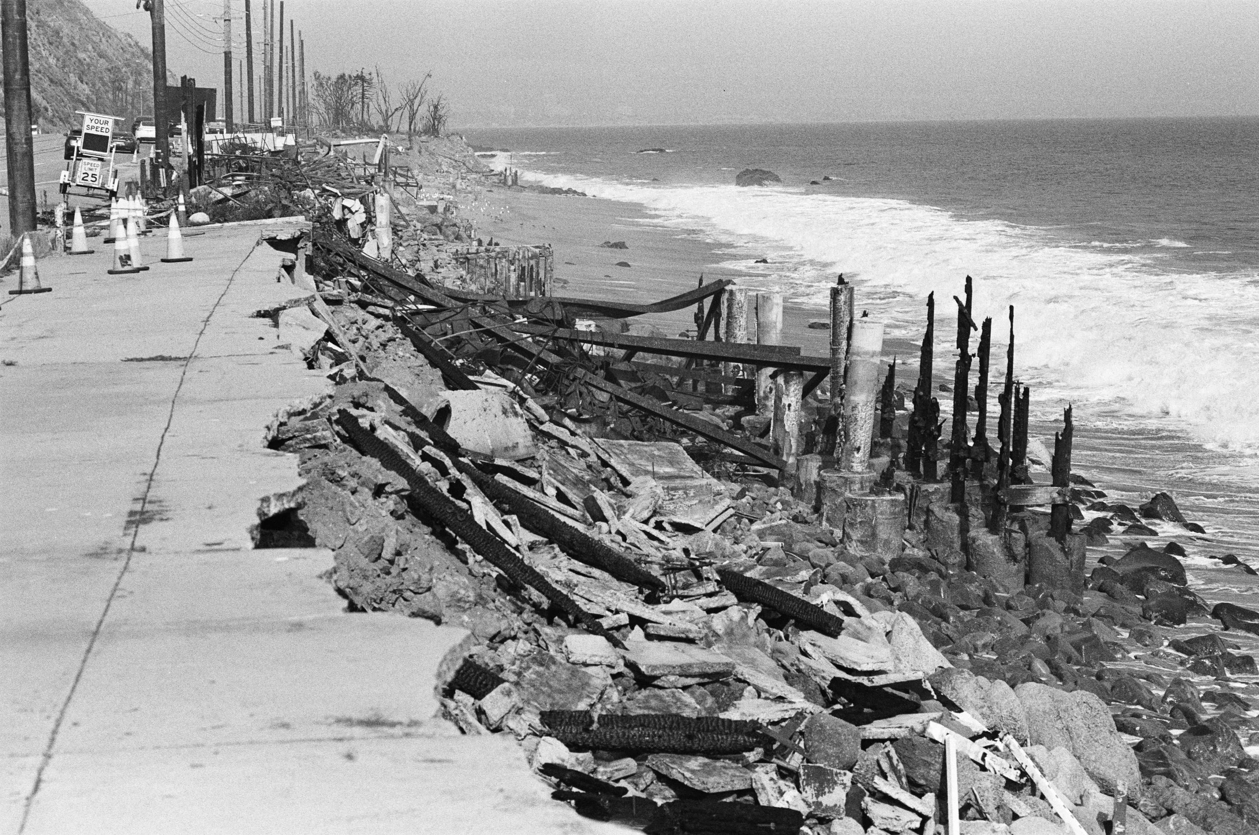
What Remains Of Hopes and Dreams - This is a somber piece. Remains of a house on the Pacific Coast Highway in Malibu, after the January 2025 Palisades Fire. Burnt outline of a house in the background with the tides coming in, while a single brick wall panel withou mailbox in the foreground. Shot on Arista Pan 100, adds moodiness contrast and forebodingness. With the fireburnt brick in the foreground contrasting strongly with the waves crashing on the beach in the background which can only be seen because the house is missing, only evidenced by its outline. Its a perptual reminder of the temporal nature of man vs the eternalness of the tides.
America: Open - Miss America Diner, Jersey City, New Jersey. This is one of my earlier works. Time exposure tripod shot of a neon and chrome glad diner, a staple of New Jersey culinary institutions.
The Waiter - From “The 2005 Collection”. From a day trip to Brussels, Belgium, from Germany, me and a friend where wandering the winding allies of Brussels’s cafe district looking for a specific bar. We heard a smash of glass and some footsteps on the cobblestone streets, and out rushed a waiter, after a person we did not get to see, who dramatically stares down the alley towards the street. Just in time I pulled up my Nikon FM2 and snapped his picture. It sat in a box for 19 years before getting a hi-res negative scan and become an instant favorite.
Liquorscape (2025) - Pop Art Remix of an earlier 2012 work named “Liquorscape”, shot on Portra 400 against the backlit “Sidewalk Cafe” in the LES of Manhattan. The warm orange tones gave a natural mysterious surreal-esq vibe, as the bottles appeared as silhouettes. The 2025 remix features a new hi-res negative scan, and given the monotones, could easily be color shifted. After discovering the photo worked along almost the entire spectrum I picked four colors, at approximately quadratic points on the color wheel and made a collage. Bottom left orange is true color. Pop Art is not my usual style, or my comfort zone as an artist, and this piece was an experiment to give it a try to see if I could in fact master it. This one turned out to be a best seller and favorite.

HWH Holiday Market - Dec 4, 2025
HWH is the corner space with the big glass windows next to emerging gallery. They have having a holiday market on art night. The specifically asked for “more affordable” works under $200/piece. In addition to showing the big 20x30s for Emerging Gallery, I have 5 8x12 framed prints I will be selling at the holiday market. These are 5 picked from inventory of existing museum grade 8x12s, framed. Normal price for a framed 8x12 is $120. For this night, and this night only, I will be selling these for $99.
HWH is the corner space with the big glass windows next to emerging gallery. They have having a holiday market on art night. In addition to showing the big 20x30s for Emerging Gallery, I have five 8x12 framed prints I will be selling at the holiday market. These are five picked from inventory of existing museum grade 8x12s, framed. Normal price for a framed 8x12 is $120. For this night, and this night only, I will be selling these for $99.
Note: HWH is a market, Emerging Gallery is a Gallery.
What this means: If you buy and pay for what I have in the Emerging Gallery, it still needs to stay up for the rest of the month. If you buy one of the smaller prints from HWH, you take it home with you that night.
Update: If there is any photo you want to buy, let me know and I will bring it. for larger prints this only applies to in inventory, but I can print any 5x7s you want

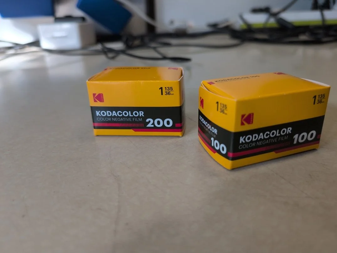
Eastman Kodacolor
Finally have it. I’ve shot Kodacolor in 100 and 200, and had some time to think it over. This is Eastman Kodak’s new film stock. Some say its Plus 200 and ProImage 100. But is it? I did NOT do a shootout, as I’ve done with other films. I just decided to shoot both, in daylight and then check results.
Finally have it. I’ve shot Kodacolor in 100 and 200, and had some time to think it over. This is Eastman Kodak’s new film stock. Some say its Plus 200 and ProImage 100. But is it? I did NOT do a shootout, as I’ve done with other films. I just decided to shoot both, in daylight and then check results.
The results? Colors are a bit dull, but otherwise its a solid film. Exposure lattitude is good. Contrast is good, and grain is rather good, especially for the 100. Grainwise, you still can’t pick out individual grains with with Kodacolor 100 and a noritsu 30 MP scan. In fact, you get more noise from the scanner than you do grain. Really not bad for a film that is less than $10 for a roll of 36.
Now.
This isn’t Portra. It doesn’t have the color, the contrast, or the absolute fineness of grain the Portra 160 has. But for less than half the price, and very much not half the quality. Compared to the vintage(Jesus, really?), still produced Gold 200 and 400(Ultramax is relabeled Gold 400), they are less saturated, less warm, closer to neutral tones. This makes a much better point if you are just getting them scanned anyway. So, if you want something other than the warm vintage tones of Kodak Gold 200, this is an alternative.
Lets take a look at some photos:
Kodacolor 100
As published - Edited in GIMP


Unedited - As Scanned


Kodacolor 200
As published - Edited in GIMP


Unedited - As Scanned


Conlusion
Not bad. Not bad at all for a film stocks that are under $10/roll. If you are budget conscious, this just might be a film for you.

Gallery Showing: Dec4 DTLA Art Night Emerging Gallery
I’ve been invited to participate in the Emerging Gallery for DTLA Art Night, December 4th. This is my first proper gallery showing. For this event I will have 5, Special Edition 20x30s framed printed with LA Film Lab’s 350 Gram Museum Etching. I will not spoil which photos I am printing, but they are all some of my most favored works.
I’ve been invited to participate in the Emerging Gallery for DTLA Art Night, December 4th. This is my first proper gallery showing. For this event I will have 5, Special Edition 20x30s framed printed with LA Film Lab’s 350 Gram Museum Etching. I will not spoil which photos I am printing, but they are all some of my most favored works.
Pricing for these will the the same $350 for a framed 20x30, but will be a one of one print.
Emerging Gallery is the start point for DTLA Art Night.
Details:
When: December 4, 2025. 6-11 PM
Where: Emerging Gallery. 125 East 4th Street, Los Angeles


Look At The New Eastman Kodacolor
All the rage is now that Eastman Kodak has released a new color film, after selling the brands to what is now Kodak Alaris.
The “Kodacolor” brand was previously what morphed into Kodak Gold in the 80s. The New Kodacolor is anyone’s guess, and comes in 100 and 100 ISO speed films. I’ve purchased a roll of each and have since shot both rolls, and will blog about it shortly.
Kodacolor 100 - Beer and Cameras Halloween edition in South Pasadena
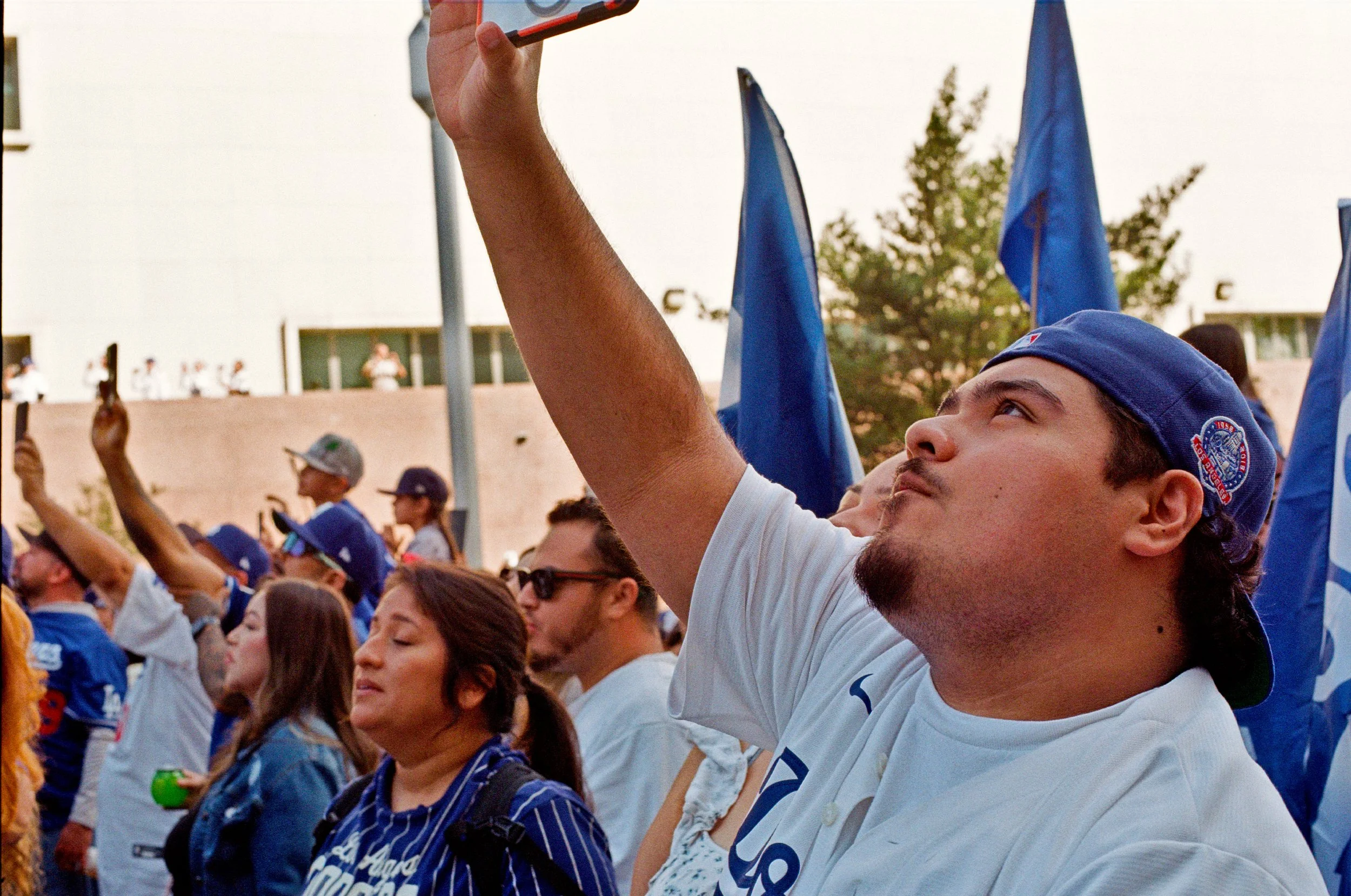
Kodacolor 200 - Dodgers World Series Parade.

Filmstock Review: Arista Pan 100
This is a cheap film stock, currently on sale, for 5 rolls for $20($4/roll) at Freestyle Photography Supply in Los Angeles. The price was right, so I’d thought I’d see what I could do. So far I’ve shot 3 rolls of the stuff. One at box speed, and the remaining two pushed to 400 and 1600. Perhaps next roll I might try pulling.
For a cheap film, it works pretty well. Especially if you are just scanning them. Lets take a look.
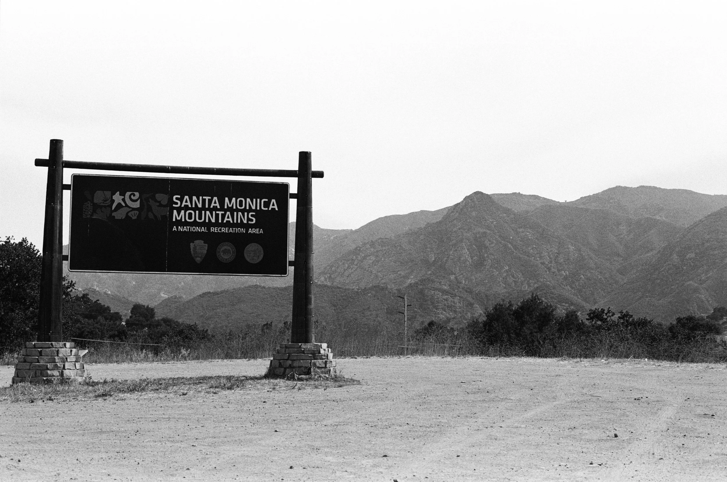
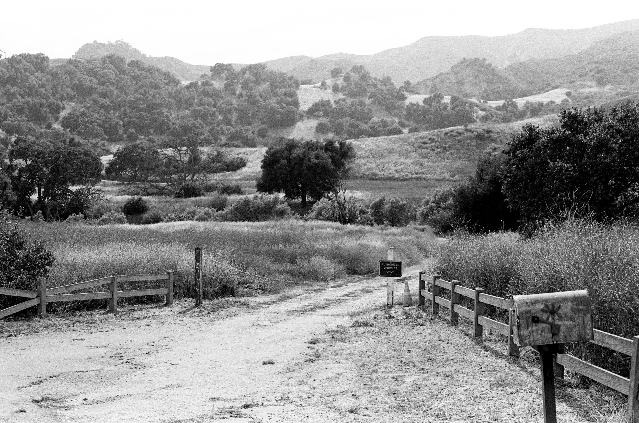
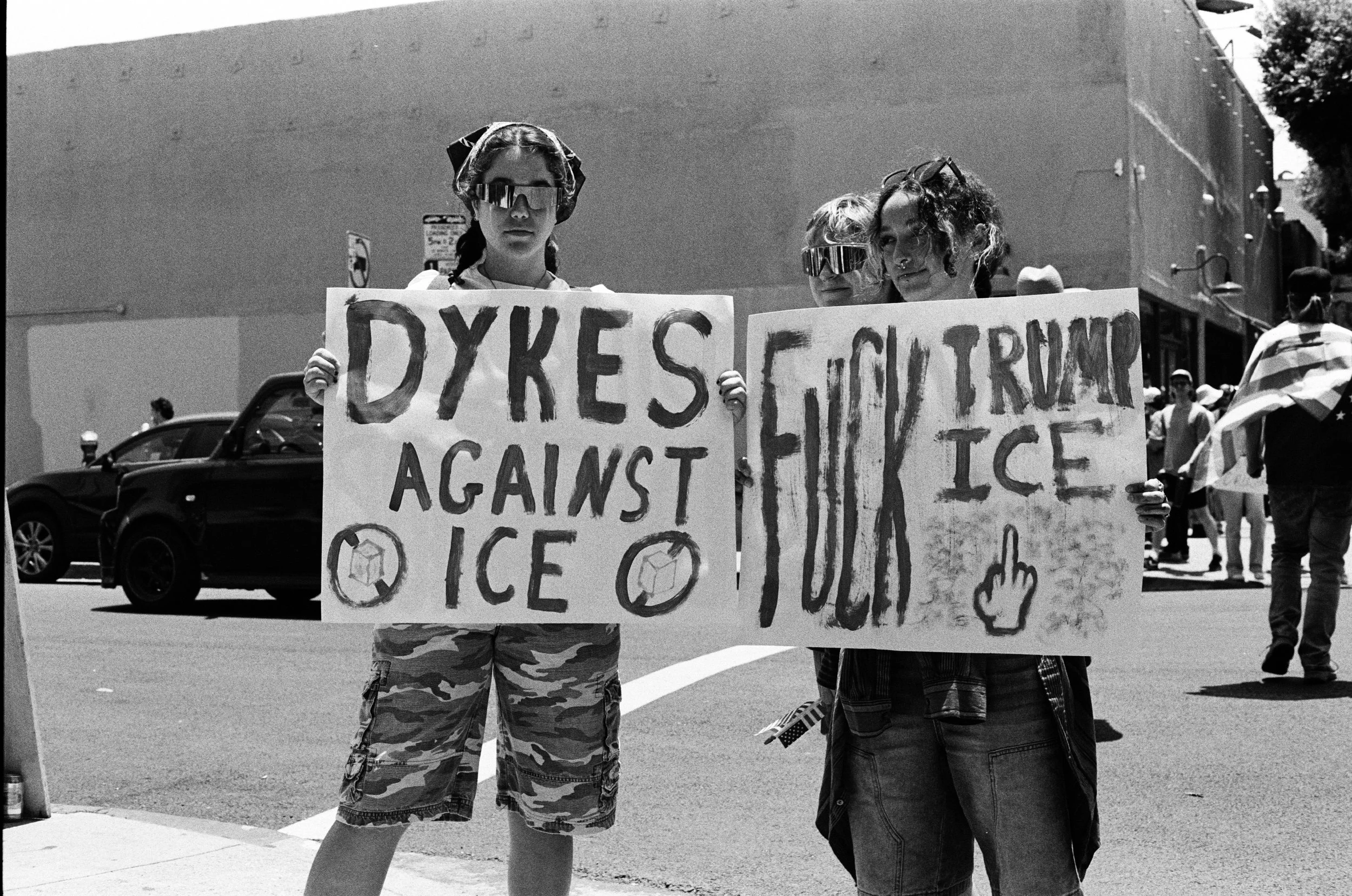
ISO 100 - Box Speed
I did a decent ride around LA County on my motorcycle. I stopped at a protest for people, hit the mountains, the PCH for ocean, and got urbanscapes and landscapes. Very reminiscent of TriX.


For the most part these are unedited, and they look like this direct scan. Pretty good. Little grainy, especially for a 100 speed film, and our darker friends, its a little sketch, but overall handsome looking film. Lets look at the unedited files for the few scans that needed some contrast correction


As you can see, not much of a difference.
ISO 400 - Push 2 stops
NOTE: Some of these had a yellow filter used.
As you can see, 400 is a little more punchy, but not by much. Not very grainy, and still perfectly good. Note that even in mixed light we still get detail in the shadows.


Lets look at a few of those unedited. The contrast correct is very slight.


ISO 1600 - Push 4 stops
This is where the fun starts. I did something really spooky for Halloween. I pushed cheap 100 speed film 4 stops to 1600. A dusk long beach photo-walk led by Open Gallery. Now this gets spooky. Punchy, Contrasty, Mysterious. There is no reason to do this, over lets say pushing TriX or HP5+ to 1600/3200, unless you really want to hit people over the head with film effects.
These are also heavily edited for contrast. far more so that more serious films like TriX or HP5


Lets take a look at the unedited photos. Total wash of grey. Usable with contrast correction, but this isn’t my first pick of film. Not bad for just fucking around with tho.


Conclusion
Film is very much worth the time, even if it comes with some limitations. Its not replacing Ilford or Kodak Black and Whites, but its certainly fun, and certainly has its uses, especially in broad daylight. Being slower than TriX, it gives grain and contrast in broad daylight that doesn’t leave you reaching for that 1/4000s shutter speed or an ND filter.

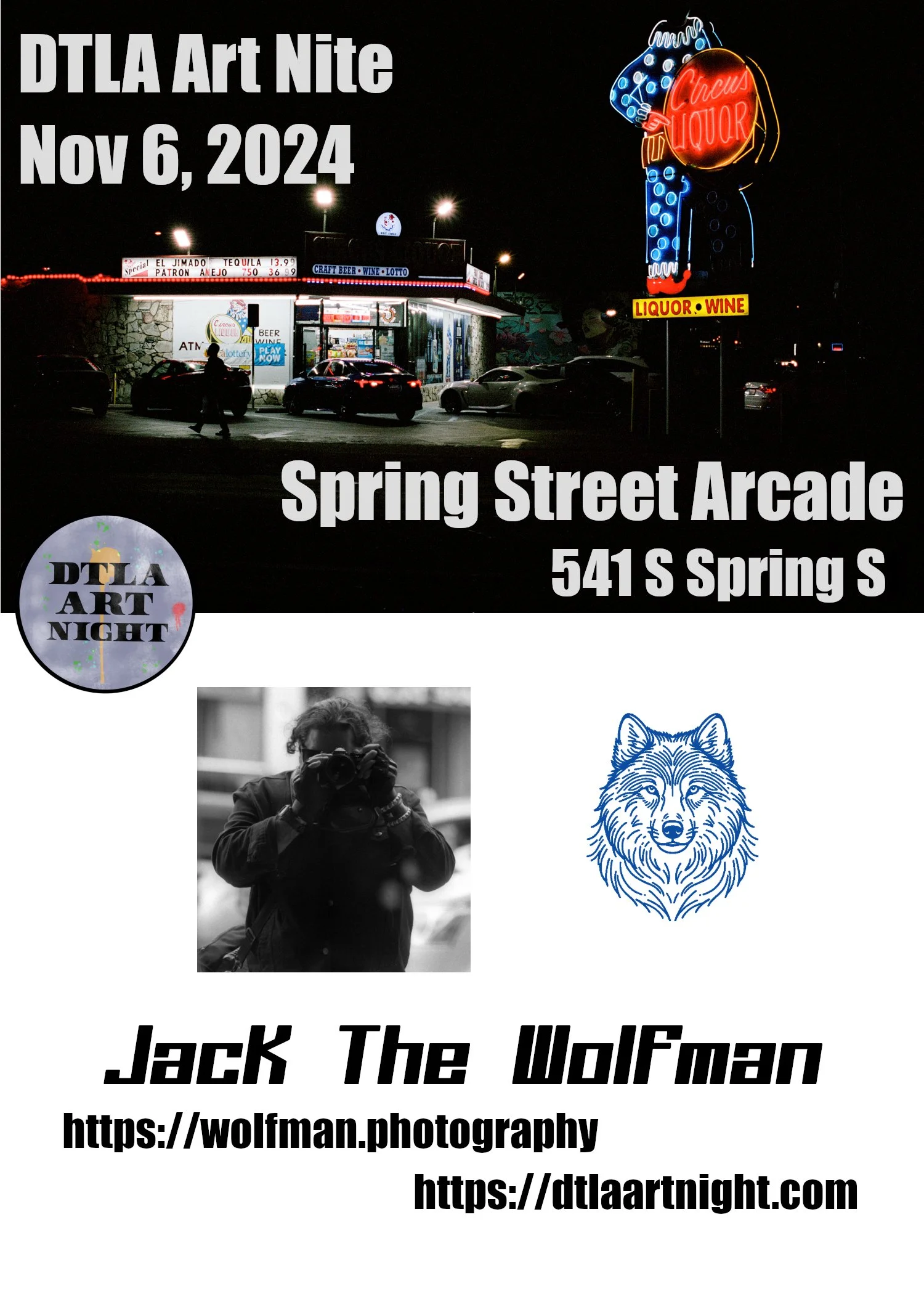
DLTA Art Nite, Nov 6, 2026
I will be in the spring street arcade selling prints. So come stop by
When:
November 6th, 2025
Where:
Spring Street Arcade
541 S Spring St, Los Angeles, CA 90013
More details:
I will be in the spring street arcade selling prints. So come stop by
When:
November 6th, 2025
6PM -> 11 PM
Where:
Spring Street Arcade
541 S Spring St, Los Angeles, CA 90013
More details:

Phoenix 200(original) - A Review
I’ve got one last roll of this stuff, as well as a roll of the new Phoenix II. After numerous complaints, the original Phoenix 200 was pulled for being just too hard to shoot, and just a little too grainy for a 200(125 native) speed film.
My experience is that it was a great film, but you needed the exact right lighting conditions, and if you shot an event where you didn’t have control of placing the object you are shooing and the sun was in the wrong spot, the photo could be ruined. It had no versatility, very unforgiving, and you needed to get the metering just right.
Lets get into some photos
Neons
My favorite subject matter. Lets start with some winners.


You get a very vintage feel. very quickly, blacks get crushed, and the black is zone 3 black, not zone 1. Very grey. Kinda feels like pre-ripped jeans. When the subject is the light itself, and you don’t want or need detail of the rest of the scene, it works great. Especially for the one on the left, where the intent was to fade to black very quickly, and produce negative space.
When you try getting background with a neon shot it doesn’t work. Here is a bracket of a sign. You can get the sign, or the background, not both. Halations look sloppy.


Now, lets say we want a mixed scene, something like “Amsterdam Billiards & Bar” my famous shot of the 11th street poolhall in Manhattan, where the neon doesn’t dominate the photo, but is a light source itself for the other elements of the film, and can be used as a fill.


You can see here that under these conditions the pictures are beyond soft, pictures run flat neons blow out beyond the tasteful halations(see Jacks Rules On Halations), and people are very blurry. Yes, I can focus, and they where in focus when taken. Both of these shots would have been amazing on either Kodak Gold or Portra
Next we can see how this works with exterior shots


The ability to use neons for fill lighting is very limited. This film doesn’t have the exposure latitude to get subtle halations while using the neon as a fill lighting to get a shadow filled wonderland. The one on the left can be a hit if you like soft, out of focus retro photos. The one on the right is a miss in any book. Halations look like crap, and blow out hard, and does not have the fill lighting effect. This would be a hit with Portra or Gold.

This one didn’t turn out too bad, but also not too good either. Its just medicore. The halations on the sign are fine, but the focus on this is terrible, and everything is fuzzy. The halations from everything else looks terrible. This could have been a crisp image with other film stocks

One last image. This one is blue-purple in real life. Phoenix looks good with red neons, OK with green neons, and complete ass for everything else. Complete color shift.
People - Daylight
Provided you mind the time of day and where the sun is. People shots, at least in daylight, tend to work well. All skin colors look handsome. It has a nice, faded look of vintage yellowed kodak film. Its grainy, but reasonable. Just make sure you get your lighting right, and get the metering right.


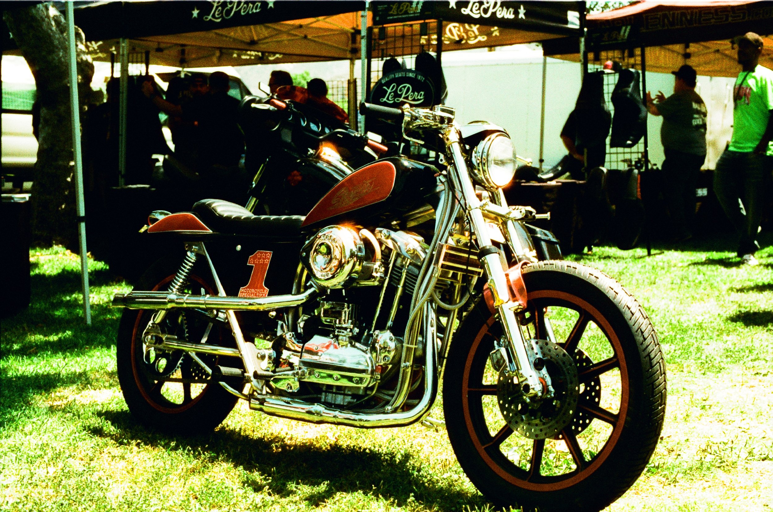
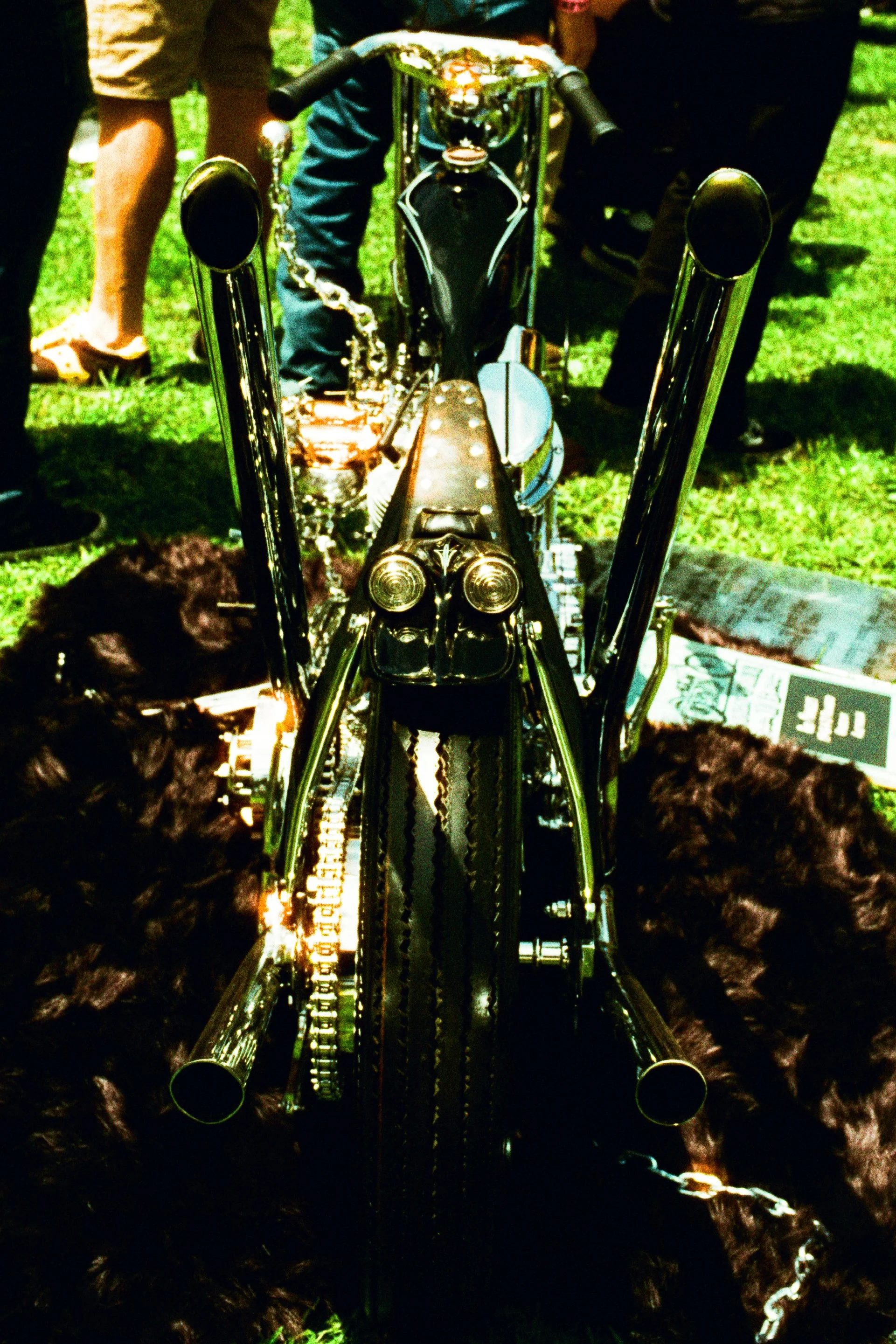
Motorcycles - Daytime
Motorcycles, especially chrome ones, tend to be trickier. The reflections from the chrome can blow out highlights and then shadows in the nooks and crannies can have crushed shadows. This can be an issue if you don’t have control of how to position the bike.
You have the color of the bike that matches the background, it can fade in. Note how this green chopper might have a brilliant shade of candy green, but on phoenix it looks like the grass

Born Free this year, on Phoenix 200


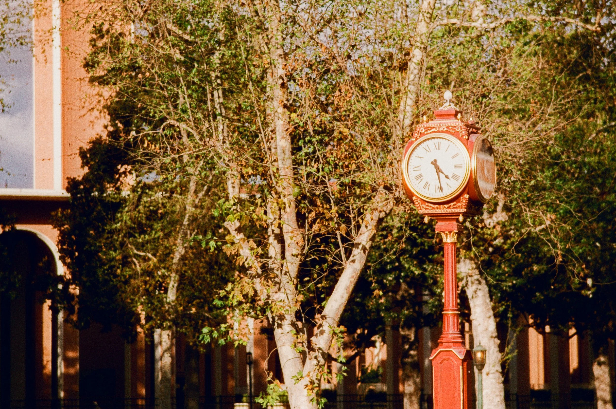
Architecture - Daytime
If you like blown out highlands and crushed shadows, then this looks good. Again, gotta be very careful where the sun is.


From a beer and cameras meet. This automatic clock company(?) had a nice shade of red in real life, but looks somewhat sour in and the trees don’t like good either. In this case it falls flat and the brilliant colors of the clock are muted.
Some more shots mixing greenery and buildings from USC/Science center tend to work pretty well. Again, with a very vintage feel


Lets get to some more “normal” buildings in town centers. Its going to be highly dependant on time of day, where the sun is, and of course, the color of the buildings. These ones look fine.


These ones are blown out


And for a sky shot. Very faded, vintage, like pre-washed, pre-ripped jeans
Ruralscapes
Last, we got some ruralscapes. Not quite rural, but empty spaces on the edges of LA County. THis is Pomona


Lots of grain. Colors tend to be nice, but crushed shadows limit its usefulness
Conclusion
Can be very beautiful, but its very tricky to shoot, and its limited in its utility. I have one last roll I am saving.

Camera Day On The RMS Queen Mary
This past weekend was National Camera Day. The ocean liner-turned-hotel RMS Queen Mary permanently parked in Long Beach held an event. There where vendors, and I was able to snag a spot on a private tour with Nikon brand ambassador Vincent Versace. This was one of the hardest days in photography I’ve had so far.
I brought 4 rolls of film, two color and two black and white: Ilford HP5+ and Kodak Portra 400.
This past weekend was National Camera Day. The ocean liner-turned-hotel RMS Queen Mary permanently parked in Long Beach held an event. There where vendors, and I was able to snag a spot on a private tour with Nikon brand ambassador Vincent Versace. This was one of the hardest days in photography I’ve had so far.
I brought 4 rolls of film, two color and two black and white: Ilford HP5+ and Kodak Portra 400. I had no idea what to expect. Lighting conditions on the Queen Mary are rough, very rough. You go from hard sunlight to interior lighting from back in an era where indoor lights where a full 4-5 stops darker than modern lights. This isn’t reflected in most modern digital pictures and walk through. As such, 400 speed film at box speed is too slow for indoors on this ship. ISO 1600 is barely light enough being forced to work with F/2 and F/1.4 at 1/60 and 1/30th of a second. Down in the engine room/hold of the ship, that isn’t even close, that is about 4 EV below that as well. On top of that, the tour went from light to dark and ended with a model shoot. On top of everything Versace based his photo shoots around modern digital cameras with high speed sensors and auto focus, shutter and aperture cameras. I do regret not trying out a Nikon Zf that the folks at Nikon where allowing people to borrow for free.
Registration started at 3 PM, and my tour was at 5 PM, so I killed some time with some above deck and top deck shots. Portra 400 and HP5+ at box speed.


Next, we went below decks. It got really dark here. I burned half a roll of HP5+ and reloaded the second roll and set the meter to 1600, and attached my speedlight. Needless to say that even down here, finding a shot that you could meter at 1600 was difficult. Still, a few hits.


From the holds of the ship, we where shown three locations with studio lighting and models posing for us while Versace went over lighting. The lesson itself was worth the price of the VIP tour. Portra 400 is very versatile film designed for digital editing. I was able to bring out the background and really bring out the color of the models in post. Still: I wish I had some Portra 160 for this one.
Bottle of champagne that was set against a light. This was an easy one. A table with a plain tablecloth and flier with a bottle of champagne that was pre-arrange and lighting was pre-done. This was an easy one.


On the way out I ran into some of the models again. They where pretty chill about me snapping some extra shots. My forte is street photography, shooting ambient light. Back in my element, I do my best work.
NOTE: Two versions for the lady in the hall ways, changing the saturation to try and get the vibe of the 1920s and better capture the earth tones inside the ship. I am split on which ones I like more, saturated or de-saturated.


Supposedly the ship is haunted. They had a separate ghost tour, but the tour guides did in fact tell me that the passenger suite B340 is one of the haunted rooms. Its locked, but they have a light on, and you can look inside. Metering is intentional here. Portra 400 has really great dynamic range, but pushed HP5+ black and white is super spooky.


One last photo. I saw a fellow photog standing on the rocks outside the ship pointing his camera through a gap in the fence on some rocks. I decided to check it out. I’ll give this one as a freebie. If you are going to see the RMS Queen Mary to take pictures look for a chain running between two fences past the bow. Bring a 50mm lens, and get the camera between the gaps where the chain is. The 50mm focal length with 35mm/FX sensor is absolute perfect, and the gap will line you up close to perfect, just get the fence bits out of the photo. All I had left was 3 shots left of HP5+ at 1600. This looks fine as is, but really doesn’t do it justice.

Shootout: Kodak TriX vs Ilford HP5+
I’ve long been a Kodak guy. TriX 400 for decades has been my go-to black and white film. When I wasn’t shooting TriX, I was shooting the gamut of other Kodak B&W films. Ilford is a legendary black and white film. When I first started in the film era, the “serious” black and white only photographers generally gravitated towards Ilford. Ilford film, Ilford developer, Ilford photo paper.
Ilford in general is the anti-kodak. While TriX has that harsh grainy contrast, Ilford tends to be softer, with finer grain and stronger mid-tones. Previously having shot some FP4+ at box speed in daylight, left me unimpressed. But for April’s Beer And Cameras, I was going to give HP5+ a direct head to head shootout against TriX, both being native 400 speed films.
The Shots
Left is HP5+, and right is TriX 400. Subject is something that used to be a big staple of my work. Classic cars. Both of these films 20th century Pedigrees. On the righ we can see that TriX has that hard contrast TriX is famous for. In this case it looks sharper, but you can see more detail with the HP5+. In post, we could probably edit the ilford, but likely just wind up like the TriX one. I personally like the TriX here. Looks sharper.


Next up is some Abstract wall art, paired with some sort of hose port. The TriX is more shadowy, and the contrast of the black and white wall art is the same between the two. The HP5+ has better detail of the foreground, and is much clearer here. Win for HP5+


Outside the Boomtown Brewery. Left is HP5+, Right is TriX. The extra contrast from the TriX gives more tones, and more details, and a bit sharper. The HP5+ has a more vintage look, which works great with the industrial looking tank out front of the building. The illusion is broke with the bubble-car style SUVs on the right. Either case, both are fine. I lean to the TriX here, but you could argue for either


Up next is another favorite subject of mine: Dark stuff. Meter the light source, so we have an overall dark, moody and shadowy scene. Usually these require post processing. But lets compare the unedited photos first. HP5+ on the left, TriX on the right. HP5+ has more detail, but TriX 400 gets more shadow. Neither are publishable as is, but lets see what happens when we apply contrast. Does the extra detail of the HP5 get preserved?


I think still in the miss pile, if due to lack of real subject, but we can get a better view. TriX seems to have better details with highlights, especially look at the couch in the foreground, but the background, HP5 comes out on top. Either case, really a wash


Up next we have some architecture and lines. Left is HP5+, and right is TriX. Here you can really tell the difference between films. Both, are equally good. We have the top right element of the building is a solid mid grey on the HP5+ and a light shade of black on the TriX. The harder contrast of the TriX produces darker more aggressive shades of grey. the HP5+ is greyer and more comforting. They are both equally as sharp, and equally as appealing, very much a presence here. This one is a draw, they are both really good


Up next is some street art. Someone stenciled some "Black Lives Matter" graffiti on the sidewalk. Combination of spray paint on concrete gives a very stark, bold, statement-oriented piece. HP5+ on the left, TriX on the right. The TriX is harder contrast and thus, the gives the monolithic piece some pop to it. The HP5+ has much more detail of the concrete. Both are acceptable. Both are good.


HP5+ on the left, TriX on the right, again. We now move from street to high art in a near by gallery. We can see how both handle abstracts such as lines. For the lines themselves, its about the same. For the sides with the columns, we can see some more contrast with the TriX giving it a slight leg up, but either would be acceptable

For the last two we have some people shots. This is Adam, who runs LA Film lab, and Beer and Cameras LA. Left is HP5+ and right is TriX. I think he's a little more clear with the HP5+, so giving this a win for the HP5+ getting people, especially in shade or shadowy conditions.


Last is the Beer and Cameras meetup. You have a good variation in skin tones here, so its a good test of shooting people of various races. HP5+(left) dealing with mid-tones better makes it a clear winner for dealing with people.


Conclusion
Each film is going to have diffrent strengths depending on subject and lighting conditions. TriX works better for objects and stark urbanscapes. Especially makes the image look sharper where hi-contrast is needed. For shooting mixed light, and people, HP5+ wins.

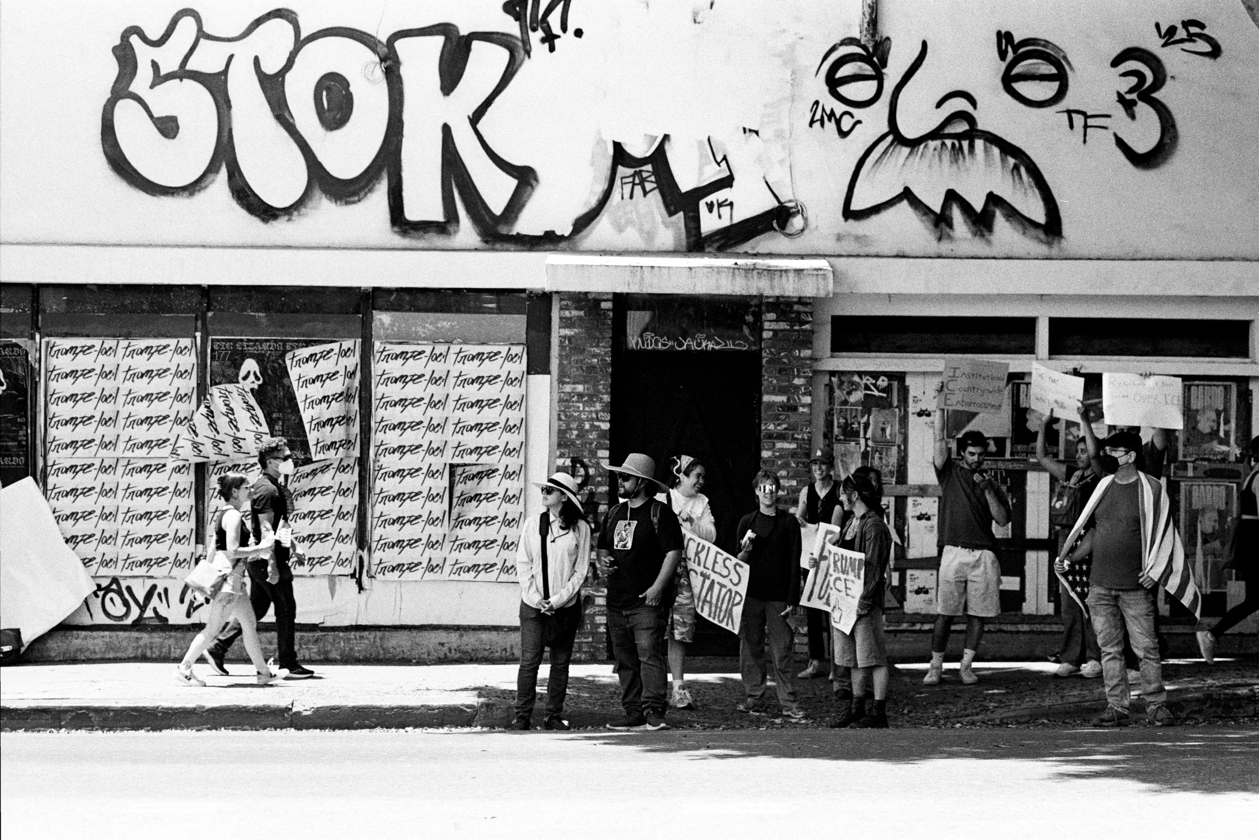
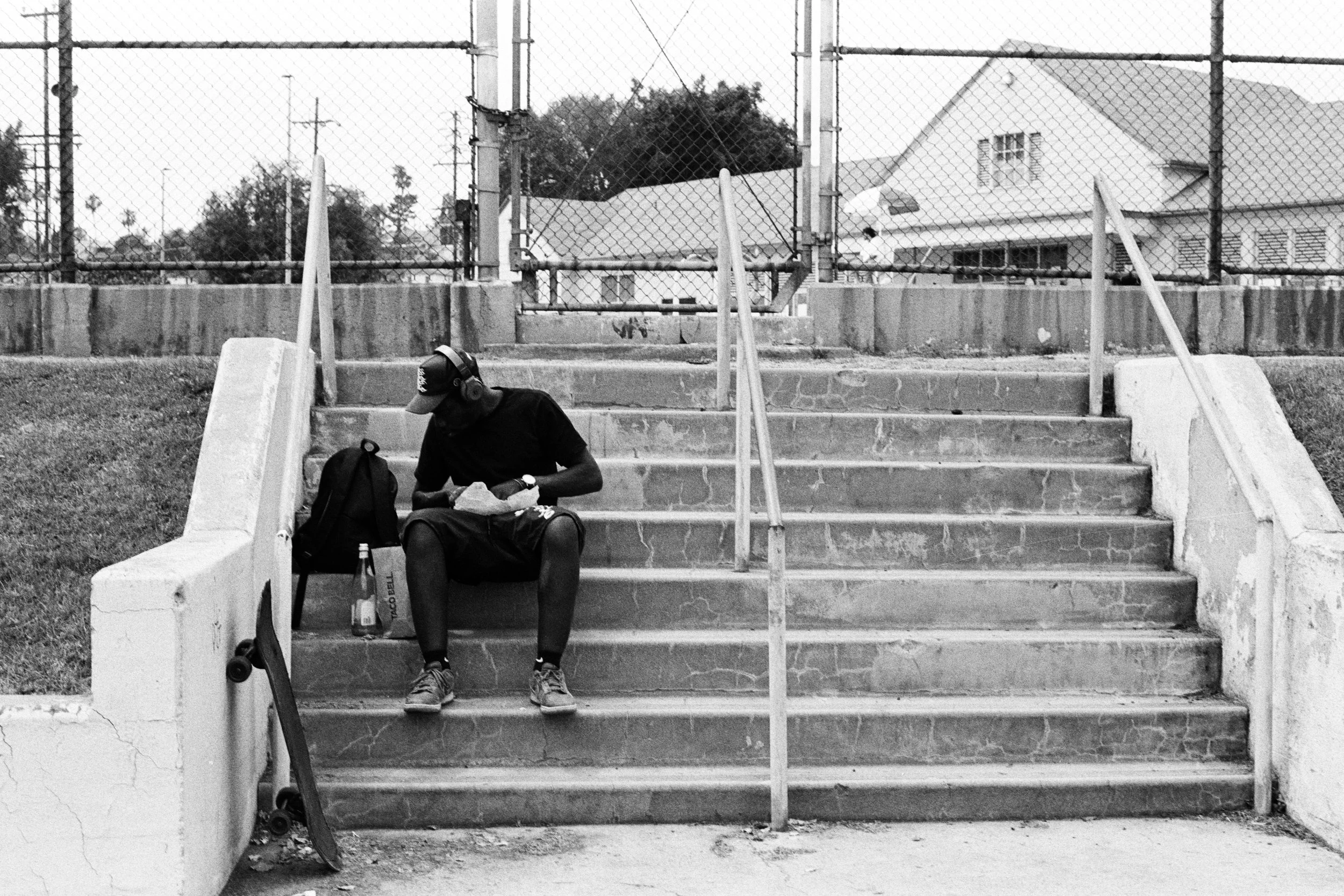
Rules Of Street Photography
I don’t think there are any real rules of street photography. Many post similar, slightly different variations, of a photographers “do no harm” philosophy, but there is no consensus on any of it, and many historical street photographers blatantly didn’t follow it. Weegee shot corpses, drunks and bums. Bruce Gilden is quoted on camera as having no morals. There is the laws on what you can and cannot take pictures, but even that isn’t followed. But none-the-less, everyone has their own code. I thought I’d preface with that, before you think that there is some cosmic force that will damn you for eternity for following this, and this is just my take, and how I shoot.
I don’t think there are any real rules of street photography. Many post similar, slightly different variations, of a photographers “do no harm” philosophy, but there is no consensus on any of it, and many historical street photographers blatantly didn’t follow it. Weegee shot corpses, drunks and bums. There is the laws on what you can and cannot take pictures, but even that isn’t followed. But none-the-less, everyone has their own code. I thought I’d preface with that, before you think that there is some cosmic force that will damn you for eternity for following this, and this is just my take, and how I shoot.
Jack’s Rules For Street Photography
Rule 1 - Carry business cards
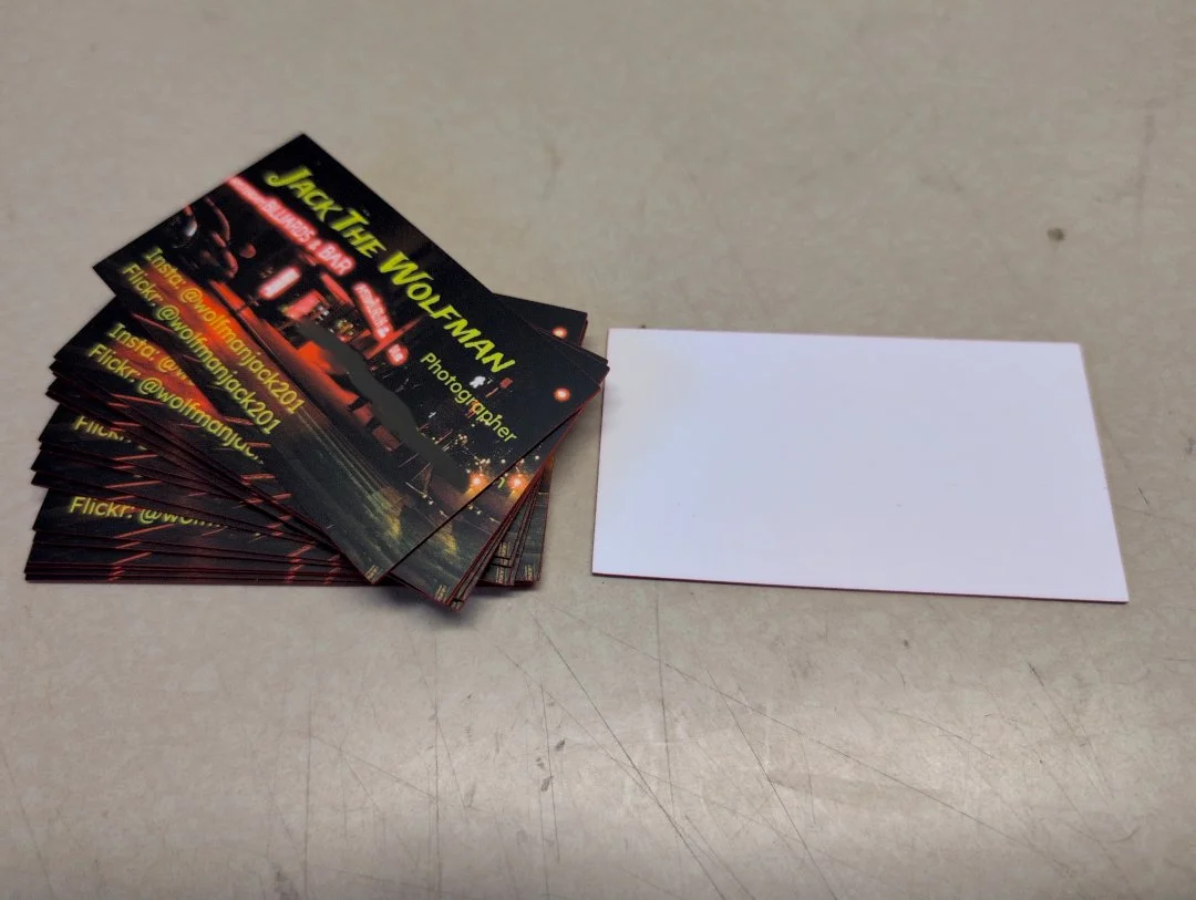
First rule of street photography: “carry business cards”. Make sure you have as much of these as you do film. Mine are super fancy because I can afford, but don’t feel shame in having a more basic card. Hand these out to people you shoot, people who ask, people who even look remotely interested in what you are doing. Hand them out liberally. Make sure you keep these stocked. Make sure you have them somewhere, where its easy to grab and hand out.
The business card has a few functions. First, is to sooth any fears people might have of someone just walking around with a camera taking pictures. Its one thing to explain you are an artist, its another to prove it. This is fairly good at getting you out of trouble with property owners, would be assailants, and paranoid people who’s first inkling is you are up to no good, either as Law Enforcement or some sort of creep. Second, is to give an avenue of contact for people in your photos in case they have any questions, concerns or want their photo taken down. Third, promote yourself, sell your artwork, give contact info to would be clients, get your name out there.
So what goes on a business card? Name, or alias you do photography as, somewhere your work can be seen such as a website, flickr, or instagram account, contact info you feel comfortable sharing with the public, and a good representative piece of your work. For me, that contact is an email, blurred out for the internet because spam reasons, but you can very much get the email by running into me IRL and getting a card. The picture on the background is “Amsterdam Billiards and Ball”, the only work of mine that currently hangs on my own wall, and has long been used to represent my work. Card in picture is the old one with my Flickr and Instagram account. The new ones have a linktr.ee, and the batch after this will have this website.
And always: Leave the back side blank white so you can write on it. Either your own notes or give to someone else, and bring a pen
Rule 2 - If The Subject Says Take It Down, Take It Down
The law states that any picture taken in a place where there is no reasonable expectation of privacy is legal. That said, there is no obligation to go right up against the edge of the law, and against rules of taste. I’m not a creep or the paparazzi, so if someone decides they don’t want their picture being used, it doesn’t. This could be as the photo is being taken. This could be after its published or years later. The subject could agree and just not like how the photo came out.
As I hand out business cards, you can contact me via email or various social media on the card, for takedown requests.
Exception: If the picture is part of a newsworthy event, and the picture is being sold to a reputable publication. Reputable meaning non-tabloid, non-gossip column. Public right to know outweighs personal privacy.
Rule 3 - Observe, Don’t Interfere
This is everything from don’t get too far into people’s business, or any further than you need to get the shot, don’t wreck an urbex site, if there is a fight or conflict, do your best to as neutral as the Swiss. There are going to be exceptions to this, if someone needs medical attention, or genuine help.
Rule 4 - Portray Things in Context As They Are
Don’t frame a photo or shot to be misleading of what is actually going on. Abstracts of portraying nothing really at all are fine.
Rule 5 - Get Lost And Be Found
Step off the beaten trail. Buy the ticket, take the ride. Follow the white rabbit. Take the side quest. Discovering something down a back alley and wandering off with a camera is a good way to find scenes and photos usually not observed. Get lost with your imagination, and find photos not otherwise taken.
Rule 6 - No Asses, Backs Of Heads
Do not capture a subject with both ass(buttocks) and back of head. They are completely turned away from you, and you got no expression of what they are doing, and could be bordering on creeper shot. If you have multiple subjects in a photo, at least one face and front.
If you absolutely need to take a picture of an ass, the subject needs to turn their head so at least part of their face is on the camera. If for whatever reason they are unable or unwilling to do this, please re-assess what you are doing.
Rule 7 - Don’t Abuse Artistic Privilege
Society, especially Los Angeles has let you bend certain rules if you make quality art. Don’t abuse this. Don’t be a creep. Don’t take non-consensual nudes. No erotic shots of unsuspecting victims. No gratuitous shots of bums, corpses, and disadvantaged people that isn’t part of larger story telling. Don’t violate people’s privacy…too much. No non-consensual pornography. Its not possible to be a street photographer without being a little weird. Don’t push this too hard, and don’t abuse it.

Shootout: Cinestill 800T vs Portra 800
This is the first of my series doing filmstock comparisons. When I do a “shootout” of film stock, I am loading two film stocks shot at the same ISO in two bodies, my Nikon FE2, and FM10. I am taking the same picture seconds apart with the same lens, at same aperture and shutter speed, by simply moving the lens from one body to the other and copying the shutter speed. The result should be a fairly accurate comparison, especially when comparing a new photostock to a familiar photostock.
This is the first of my series doing filmstock comparisons. When I do a “shootout” of film stock, I am loading two film stocks shot at the same ISO in two bodies, my Nikon FE2, and FM10. I am taking the same picture seconds apart with the same lens, at same aperture and shutter speed, by simply moving the lens from one body to the other and copying the shutter speed. The result should be a fairly accurate comparison, especially when comparing a new photostock to a familiar photostock.
For this edition, we have Cinestill 800T vs Kodak Portra 800. When I first got back into photography in early 2024, I noticed a lot of things have changed. Some things where the same, such as TriX, TMAX and Portra. FujiFilm was more or less gone, and all these new boxes where now in the film store. One of the new films, was Cinestill.
Cinestill, like Portra is made by Kodak. Originally sold as Vision for 35mm movie cameras, companies like Cinestill remove the anti-halation layer, so it can be processed directly with C41, and then package it in 135 Canisters. The people at the film store(LGFL) told me it was great for neons and halations, two big items that feature heavily in my work. I decided to give it a try, but I was going to test it against my old go to Kodak Portra. Again note, these are both same ISO film, with same shutter speed and aperture. As much as possible, same lighting conditions as well. No flash was used. Also these are the raw negative scans, and are NOT edited, so they will be slightly different from the published versions.
Venue of choice was the Pinguino’s annual Ninja Penguin party. Lots of Glowey stuff, in a dark dance floor. Perfect choice for 800 speed film.
Left is Cinestill 800T. Right is Portra 800
First up is a people shot. This is a tricky one as its in dim club lighting, and our subject is wearing a very shiny reflect suit. Portra easily handles the highlights better, as well as gives much richer shades of green in the background. The Cinestill looks flat by comparison. You can see much more detail on the man’s face. The tungsten balance might adjust for the artificial lighting, but it kills the mood.


Next up is “Camera in a Dream”(Left), and its Cinestill alt(right). You can see when doing abstracts with light play, the color and warmth of the Portra just blows away the Cinestill.


Light and Shadow play a white fuzzy vest with LED lights in it. Lighting is pretty close, with you can see the portra being sharper, with a crisper image. The Cinestill is softer and dreamier. About even with this one


An attempt at wall art. This one is pulled from the “miss” pile in both, but does a decent job highlighting the characteristics of the film with light. Both are unedited. Portra clearly has more exposure lattitude, as well as better contrast for dealing with shadows. The colors are more vivid and rich. This might be attributed to the tungsten balance. That would make sense for film clear shots for commercial purposes, but it falls short delivering vivid crisp images for artistic endeavors.


The last two are some costume play. Its not clear from the post, but that is a prop of Bruce Willis’s pistol from “The 5th Element”, appropriate given that was the theme of the party. Here is my friend doing some cosplay outside the venue with said prop, illuminated by a sodium vapor lamp street light. Gives a good comparison of how the film performs for nighttime street photography. You can see the tungsten balance of the Cinestill neutralizing the soft yellow glow of the street light, while the portra beautifully soaks up the vibe. This is going to be preference, but I like my streetlights yellow. The Portra captures vibes, the Cinestill extinguishes them


One last one, again pulled from the miss pile, but of technical note. You can see how the cinestill interacts with streetlights. All the streetlights in frame are sodium vapor lamps, which appear white, with some really ugly red halations. From a technical note, none of the color in this scene really looks good. The mid-tones and shadows look OK. That is it OK. Portra, and even Kodak Gold(now UltraMaxx for 400/800), make this look a fuckton better.

Conclusion: Kodak Portra 800 wipes the floor with Cinestill 800T

Jack’s Photoblog
Welcome to my website. I’ve finally bitten the bullet and got myself a website. I will have a gallery for my work. I will also have links to my social media and other presence.
Welcome to my website. I’ve finally bitten the bullet and got myself a website. I will have a gallery for my work. I will also have links to my social media and other prescence.
I also plan to use this blog for my musings on photography. Gallery showings, book announcements, and more art fair engagements