
Phoenix 200(original) - A Review
I’ve got one last roll of this stuff, as well as a roll of the new Phoenix II. After numerous complaints, the original Phoenix 200 was pulled for being just too hard to shoot, and just a little too grainy for a 200(125 native) speed film.
My experience is that it was a great film, but you needed the exact right lighting conditions, and if you shot an event where you didn’t have control of placing the object you are shooing and the sun was in the wrong spot, the photo could be ruined. It had no versatility, very unforgiving, and you needed to get the metering just right.
Lets get into some photos
Neons
My favorite subject matter. Lets start with some winners.


You get a very vintage feel. very quickly, blacks get crushed, and the black is zone 3 black, not zone 1. Very grey. Kinda feels like pre-ripped jeans. When the subject is the light itself, and you don’t want or need detail of the rest of the scene, it works great. Especially for the one on the left, where the intent was to fade to black very quickly, and produce negative space.
When you try getting background with a neon shot it doesn’t work. Here is a bracket of a sign. You can get the sign, or the background, not both. Halations look sloppy.


Now, lets say we want a mixed scene, something like “Amsterdam Billiards & Bar” my famous shot of the 11th street poolhall in Manhattan, where the neon doesn’t dominate the photo, but is a light source itself for the other elements of the film, and can be used as a fill.


You can see here that under these conditions the pictures are beyond soft, pictures run flat neons blow out beyond the tasteful halations(see Jacks Rules On Halations), and people are very blurry. Yes, I can focus, and they where in focus when taken. Both of these shots would have been amazing on either Kodak Gold or Portra
Next we can see how this works with exterior shots


The ability to use neons for fill lighting is very limited. This film doesn’t have the exposure latitude to get subtle halations while using the neon as a fill lighting to get a shadow filled wonderland. The one on the left can be a hit if you like soft, out of focus retro photos. The one on the right is a miss in any book. Halations look like crap, and blow out hard, and does not have the fill lighting effect. This would be a hit with Portra or Gold.

This one didn’t turn out too bad, but also not too good either. Its just medicore. The halations on the sign are fine, but the focus on this is terrible, and everything is fuzzy. The halations from everything else looks terrible. This could have been a crisp image with other film stocks

One last image. This one is blue-purple in real life. Phoenix looks good with red neons, OK with green neons, and complete ass for everything else. Complete color shift.
People - Daylight
Provided you mind the time of day and where the sun is. People shots, at least in daylight, tend to work well. All skin colors look handsome. It has a nice, faded look of vintage yellowed kodak film. Its grainy, but reasonable. Just make sure you get your lighting right, and get the metering right.


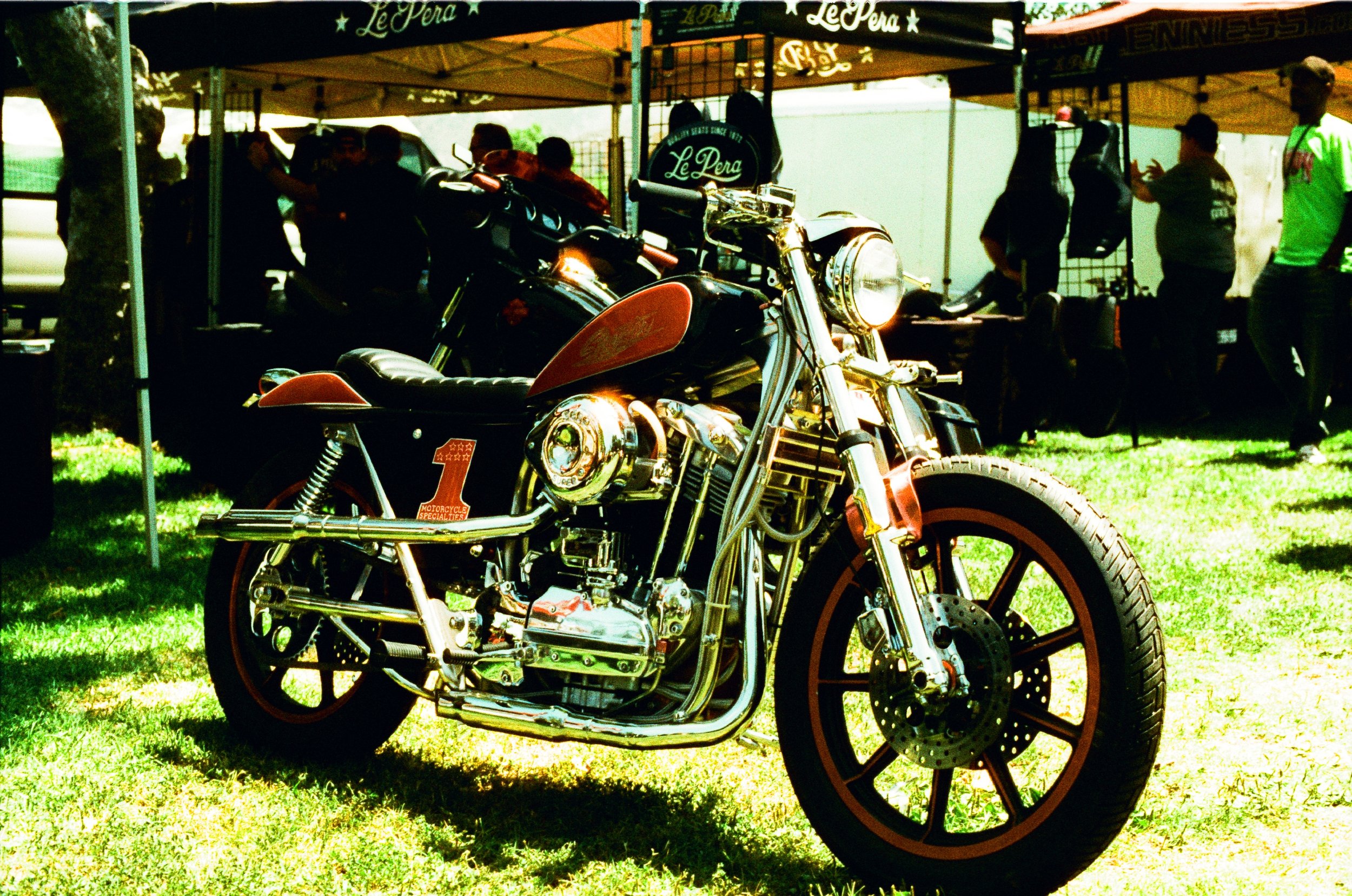
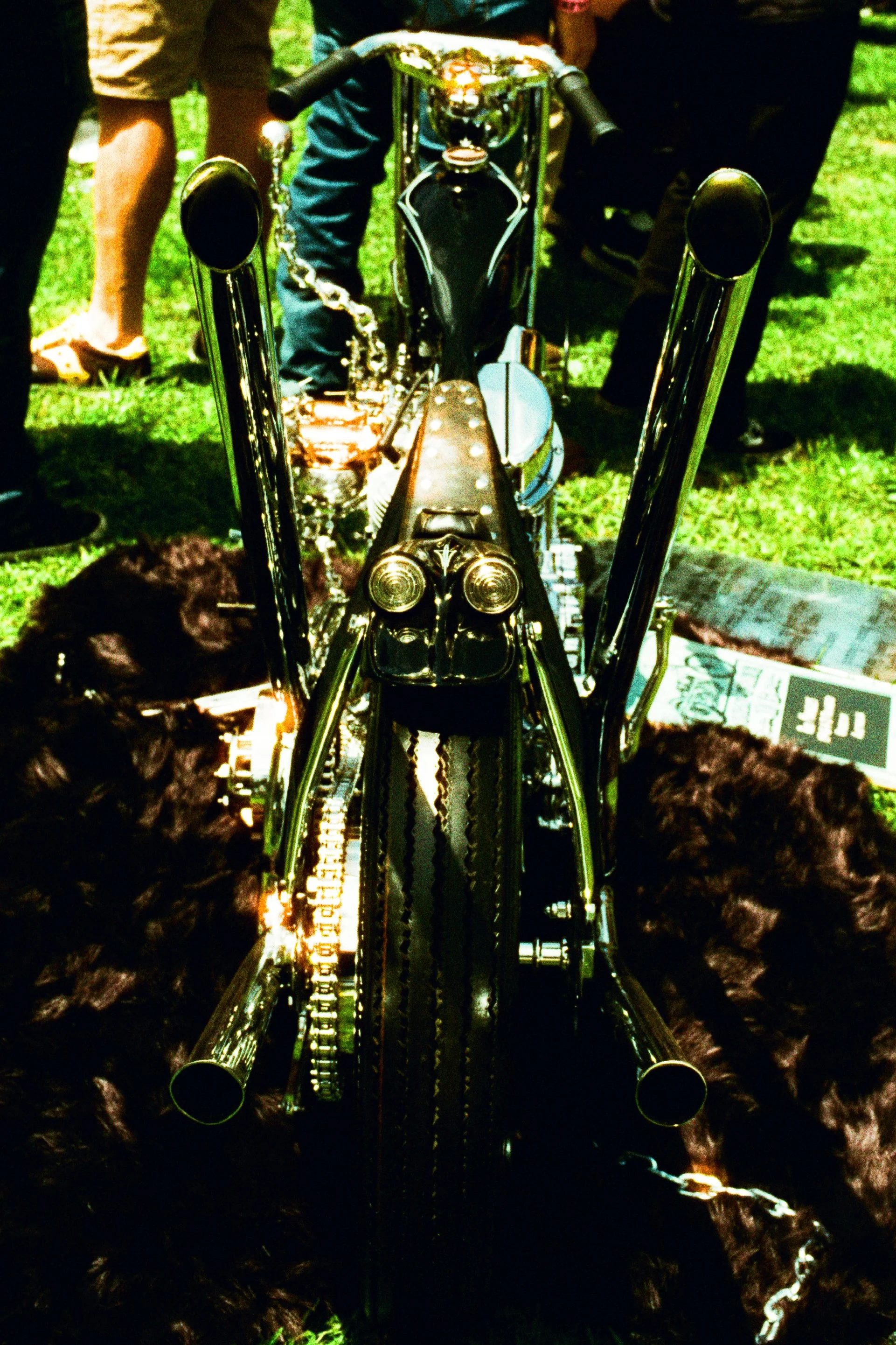
Motorcycles - Daytime
Motorcycles, especially chrome ones, tend to be trickier. The reflections from the chrome can blow out highlights and then shadows in the nooks and crannies can have crushed shadows. This can be an issue if you don’t have control of how to position the bike.
You have the color of the bike that matches the background, it can fade in. Note how this green chopper might have a brilliant shade of candy green, but on phoenix it looks like the grass

Born Free this year, on Phoenix 200


Architecture - Daytime
If you like blown out highlands and crushed shadows, then this looks good. Again, gotta be very careful where the sun is.


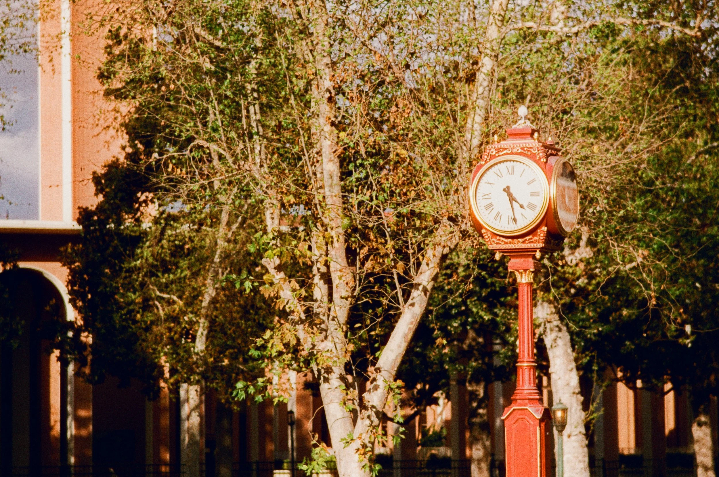
From a beer and cameras meet. This automatic clock company(?) had a nice shade of red in real life, but looks somewhat sour in and the trees don’t like good either. In this case it falls flat and the brilliant colors of the clock are muted.
Some more shots mixing greenery and buildings from USC/Science center tend to work pretty well. Again, with a very vintage feel


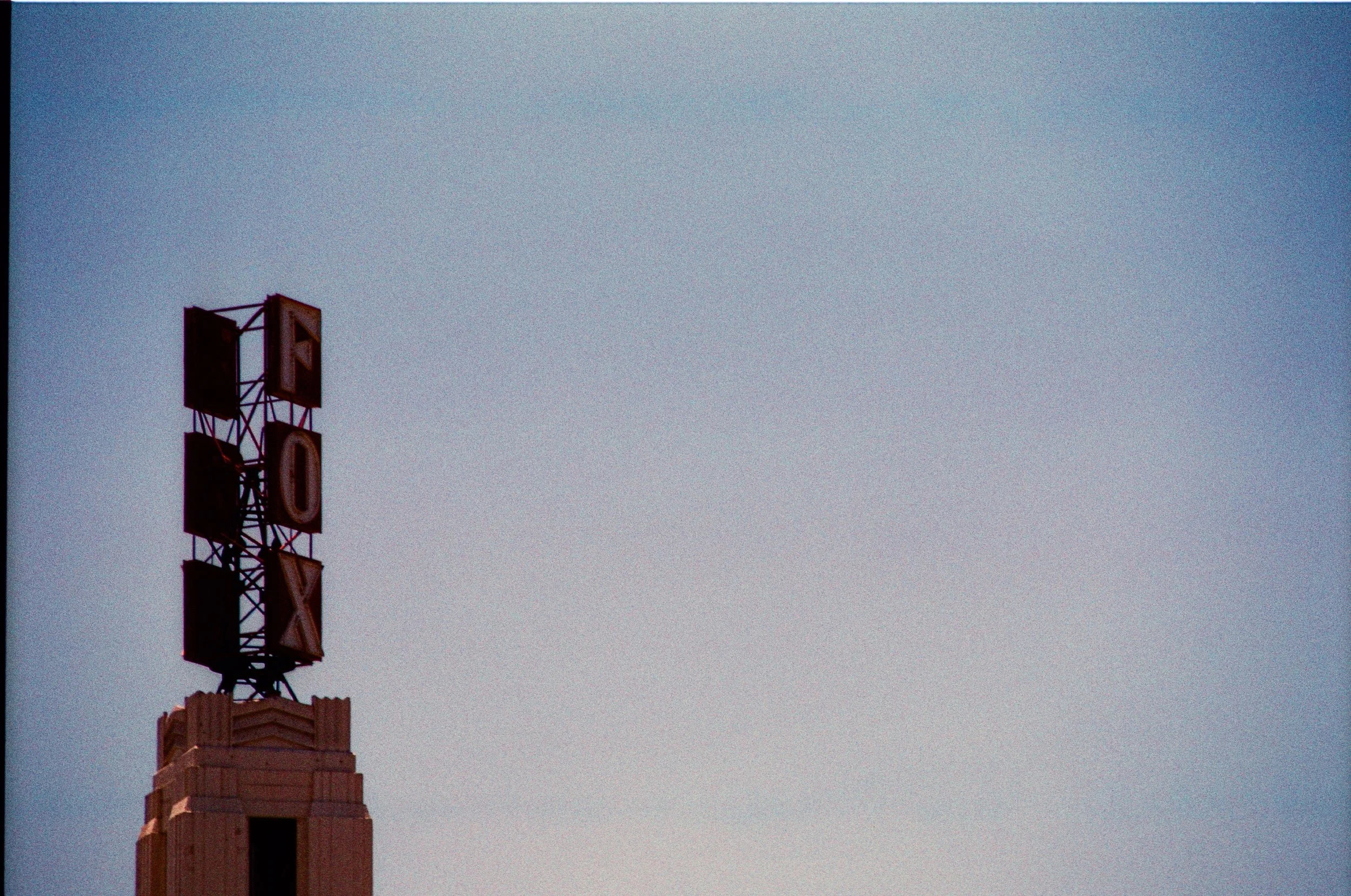
Lets get to some more “normal” buildings in town centers. Its going to be highly dependant on time of day, where the sun is, and of course, the color of the buildings. These ones look fine.


These ones are blown out


And for a sky shot. Very faded, vintage, like pre-washed, pre-ripped jeans
Ruralscapes
Last, we got some ruralscapes. Not quite rural, but empty spaces on the edges of LA County. THis is Pomona


Lots of grain. Colors tend to be nice, but crushed shadows limit its usefulness
Conclusion
Can be very beautiful, but its very tricky to shoot, and its limited in its utility. I have one last roll I am saving.