

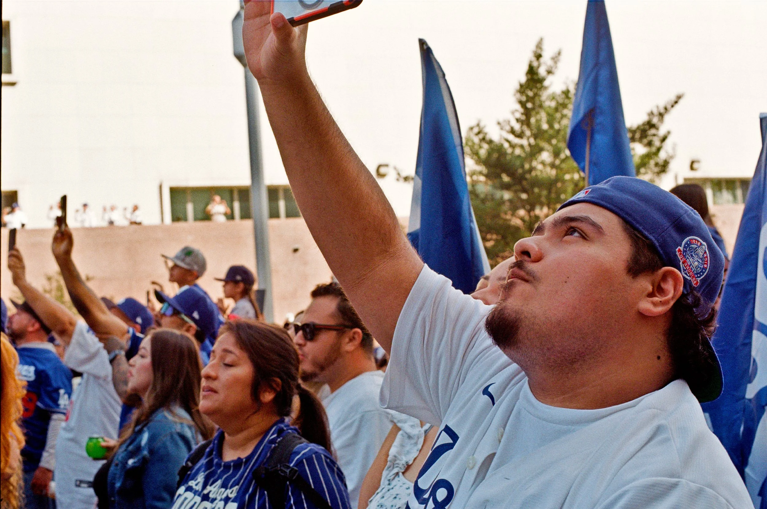
Eastman Kodacolor
Finally have it. I’ve shot Kodacolor in 100 and 200, and had some time to think it over. This is Eastman Kodak’s new film stock. Some say its Plus 200 and ProImage 100. But is it? I did NOT do a shootout, as I’ve done with other films. I just decided to shoot both, in daylight and then check results.
Finally have it. I’ve shot Kodacolor in 100 and 200, and had some time to think it over. This is Eastman Kodak’s new film stock. Some say its Plus 200 and ProImage 100. But is it? I did NOT do a shootout, as I’ve done with other films. I just decided to shoot both, in daylight and then check results.
The results? Colors are a bit dull, but otherwise its a solid film. Exposure lattitude is good. Contrast is good, and grain is rather good, especially for the 100. Grainwise, you still can’t pick out individual grains with with Kodacolor 100 and a noritsu 30 MP scan. In fact, you get more noise from the scanner than you do grain. Really not bad for a film that is less than $10 for a roll of 36.
Now.
This isn’t Portra. It doesn’t have the color, the contrast, or the absolute fineness of grain the Portra 160 has. But for less than half the price, and very much not half the quality. Compared to the vintage(Jesus, really?), still produced Gold 200 and 400(Ultramax is relabeled Gold 400), they are less saturated, less warm, closer to neutral tones. This makes a much better point if you are just getting them scanned anyway. So, if you want something other than the warm vintage tones of Kodak Gold 200, this is an alternative.
Lets take a look at some photos:
Kodacolor 100
As published - Edited in GIMP


Unedited - As Scanned


Kodacolor 200
As published - Edited in GIMP


Unedited - As Scanned


Conlusion
Not bad. Not bad at all for a film stocks that are under $10/roll. If you are budget conscious, this just might be a film for you.

Shootout: Kodak TriX vs Ilford HP5+
I’ve long been a Kodak guy. TriX 400 for decades has been my go-to black and white film. When I wasn’t shooting TriX, I was shooting the gamut of other Kodak B&W films. Ilford is a legendary black and white film. When I first started in the film era, the “serious” black and white only photographers generally gravitated towards Ilford. Ilford film, Ilford developer, Ilford photo paper.
Ilford in general is the anti-kodak. While TriX has that harsh grainy contrast, Ilford tends to be softer, with finer grain and stronger mid-tones. Previously having shot some FP4+ at box speed in daylight, left me unimpressed. But for April’s Beer And Cameras, I was going to give HP5+ a direct head to head shootout against TriX, both being native 400 speed films.
The Shots
Left is HP5+, and right is TriX 400. Subject is something that used to be a big staple of my work. Classic cars. Both of these films 20th century Pedigrees. On the righ we can see that TriX has that hard contrast TriX is famous for. In this case it looks sharper, but you can see more detail with the HP5+. In post, we could probably edit the ilford, but likely just wind up like the TriX one. I personally like the TriX here. Looks sharper.


Next up is some Abstract wall art, paired with some sort of hose port. The TriX is more shadowy, and the contrast of the black and white wall art is the same between the two. The HP5+ has better detail of the foreground, and is much clearer here. Win for HP5+


Outside the Boomtown Brewery. Left is HP5+, Right is TriX. The extra contrast from the TriX gives more tones, and more details, and a bit sharper. The HP5+ has a more vintage look, which works great with the industrial looking tank out front of the building. The illusion is broke with the bubble-car style SUVs on the right. Either case, both are fine. I lean to the TriX here, but you could argue for either


Up next is another favorite subject of mine: Dark stuff. Meter the light source, so we have an overall dark, moody and shadowy scene. Usually these require post processing. But lets compare the unedited photos first. HP5+ on the left, TriX on the right. HP5+ has more detail, but TriX 400 gets more shadow. Neither are publishable as is, but lets see what happens when we apply contrast. Does the extra detail of the HP5 get preserved?


I think still in the miss pile, if due to lack of real subject, but we can get a better view. TriX seems to have better details with highlights, especially look at the couch in the foreground, but the background, HP5 comes out on top. Either case, really a wash


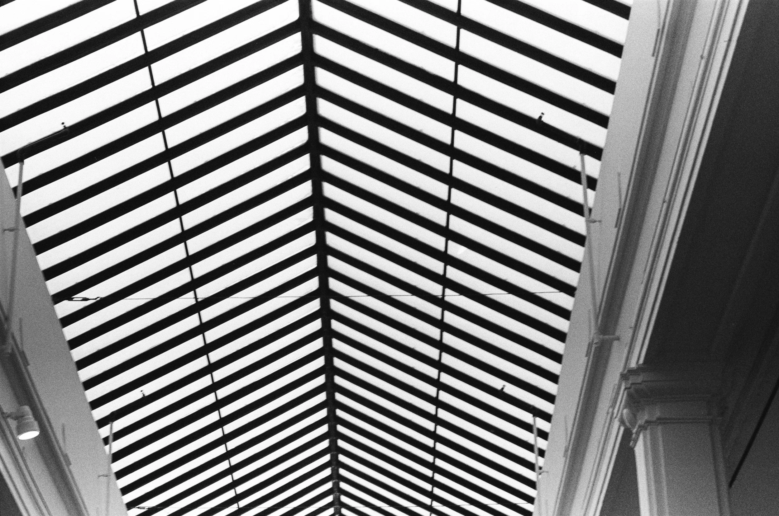
Up next we have some architecture and lines. Left is HP5+, and right is TriX. Here you can really tell the difference between films. Both, are equally good. We have the top right element of the building is a solid mid grey on the HP5+ and a light shade of black on the TriX. The harder contrast of the TriX produces darker more aggressive shades of grey. the HP5+ is greyer and more comforting. They are both equally as sharp, and equally as appealing, very much a presence here. This one is a draw, they are both really good


Up next is some street art. Someone stenciled some "Black Lives Matter" graffiti on the sidewalk. Combination of spray paint on concrete gives a very stark, bold, statement-oriented piece. HP5+ on the left, TriX on the right. The TriX is harder contrast and thus, the gives the monolithic piece some pop to it. The HP5+ has much more detail of the concrete. Both are acceptable. Both are good.


HP5+ on the left, TriX on the right, again. We now move from street to high art in a near by gallery. We can see how both handle abstracts such as lines. For the lines themselves, its about the same. For the sides with the columns, we can see some more contrast with the TriX giving it a slight leg up, but either would be acceptable

For the last two we have some people shots. This is Adam, who runs LA Film lab, and Beer and Cameras LA. Left is HP5+ and right is TriX. I think he's a little more clear with the HP5+, so giving this a win for the HP5+ getting people, especially in shade or shadowy conditions.


Last is the Beer and Cameras meetup. You have a good variation in skin tones here, so its a good test of shooting people of various races. HP5+(left) dealing with mid-tones better makes it a clear winner for dealing with people.


Conclusion
Each film is going to have diffrent strengths depending on subject and lighting conditions. TriX works better for objects and stark urbanscapes. Especially makes the image look sharper where hi-contrast is needed. For shooting mixed light, and people, HP5+ wins.

Shootout: Cinestill 800T vs Portra 800
This is the first of my series doing filmstock comparisons. When I do a “shootout” of film stock, I am loading two film stocks shot at the same ISO in two bodies, my Nikon FE2, and FM10. I am taking the same picture seconds apart with the same lens, at same aperture and shutter speed, by simply moving the lens from one body to the other and copying the shutter speed. The result should be a fairly accurate comparison, especially when comparing a new photostock to a familiar photostock.
This is the first of my series doing filmstock comparisons. When I do a “shootout” of film stock, I am loading two film stocks shot at the same ISO in two bodies, my Nikon FE2, and FM10. I am taking the same picture seconds apart with the same lens, at same aperture and shutter speed, by simply moving the lens from one body to the other and copying the shutter speed. The result should be a fairly accurate comparison, especially when comparing a new photostock to a familiar photostock.
For this edition, we have Cinestill 800T vs Kodak Portra 800. When I first got back into photography in early 2024, I noticed a lot of things have changed. Some things where the same, such as TriX, TMAX and Portra. FujiFilm was more or less gone, and all these new boxes where now in the film store. One of the new films, was Cinestill.
Cinestill, like Portra is made by Kodak. Originally sold as Vision for 35mm movie cameras, companies like Cinestill remove the anti-halation layer, so it can be processed directly with C41, and then package it in 135 Canisters. The people at the film store(LGFL) told me it was great for neons and halations, two big items that feature heavily in my work. I decided to give it a try, but I was going to test it against my old go to Kodak Portra. Again note, these are both same ISO film, with same shutter speed and aperture. As much as possible, same lighting conditions as well. No flash was used. Also these are the raw negative scans, and are NOT edited, so they will be slightly different from the published versions.
Venue of choice was the Pinguino’s annual Ninja Penguin party. Lots of Glowey stuff, in a dark dance floor. Perfect choice for 800 speed film.
Left is Cinestill 800T. Right is Portra 800
First up is a people shot. This is a tricky one as its in dim club lighting, and our subject is wearing a very shiny reflect suit. Portra easily handles the highlights better, as well as gives much richer shades of green in the background. The Cinestill looks flat by comparison. You can see much more detail on the man’s face. The tungsten balance might adjust for the artificial lighting, but it kills the mood.


Next up is “Camera in a Dream”(Left), and its Cinestill alt(right). You can see when doing abstracts with light play, the color and warmth of the Portra just blows away the Cinestill.


Light and Shadow play a white fuzzy vest with LED lights in it. Lighting is pretty close, with you can see the portra being sharper, with a crisper image. The Cinestill is softer and dreamier. About even with this one


An attempt at wall art. This one is pulled from the “miss” pile in both, but does a decent job highlighting the characteristics of the film with light. Both are unedited. Portra clearly has more exposure lattitude, as well as better contrast for dealing with shadows. The colors are more vivid and rich. This might be attributed to the tungsten balance. That would make sense for film clear shots for commercial purposes, but it falls short delivering vivid crisp images for artistic endeavors.


The last two are some costume play. Its not clear from the post, but that is a prop of Bruce Willis’s pistol from “The 5th Element”, appropriate given that was the theme of the party. Here is my friend doing some cosplay outside the venue with said prop, illuminated by a sodium vapor lamp street light. Gives a good comparison of how the film performs for nighttime street photography. You can see the tungsten balance of the Cinestill neutralizing the soft yellow glow of the street light, while the portra beautifully soaks up the vibe. This is going to be preference, but I like my streetlights yellow. The Portra captures vibes, the Cinestill extinguishes them


One last one, again pulled from the miss pile, but of technical note. You can see how the cinestill interacts with streetlights. All the streetlights in frame are sodium vapor lamps, which appear white, with some really ugly red halations. From a technical note, none of the color in this scene really looks good. The mid-tones and shadows look OK. That is it OK. Portra, and even Kodak Gold(now UltraMaxx for 400/800), make this look a fuckton better.

Conclusion: Kodak Portra 800 wipes the floor with Cinestill 800T